The mobile app was designed as a companion to the desktop dashboard, but key insights and workflows became harder to access on a small screen. The redesign focused on creating a clearer hierarchy, enabling faster scanning and simplifying transaction flows to support everyday business monitoring.
The primary users of the mobile dashboard are employees responsible for financial metrics and business outcomes. The app is designed for users who rely on mobile access for daily monitoring and quick decisions.
The analysis was based on internal data, support requests and a detailed review of the existing dashboard, focusing on real usage patterns and recurring issues in daily financial decision-making workflows.

Based on product analysis and identified pain points, the key interface issues were defined to guide the redesign process.

The credits area contains too many data points at once, making it hard to scan and understand what matters. The layout lacks clear grouping and prioritization, which increases cognitive load and slows down navigation.

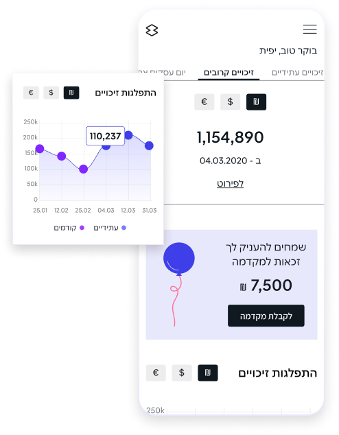
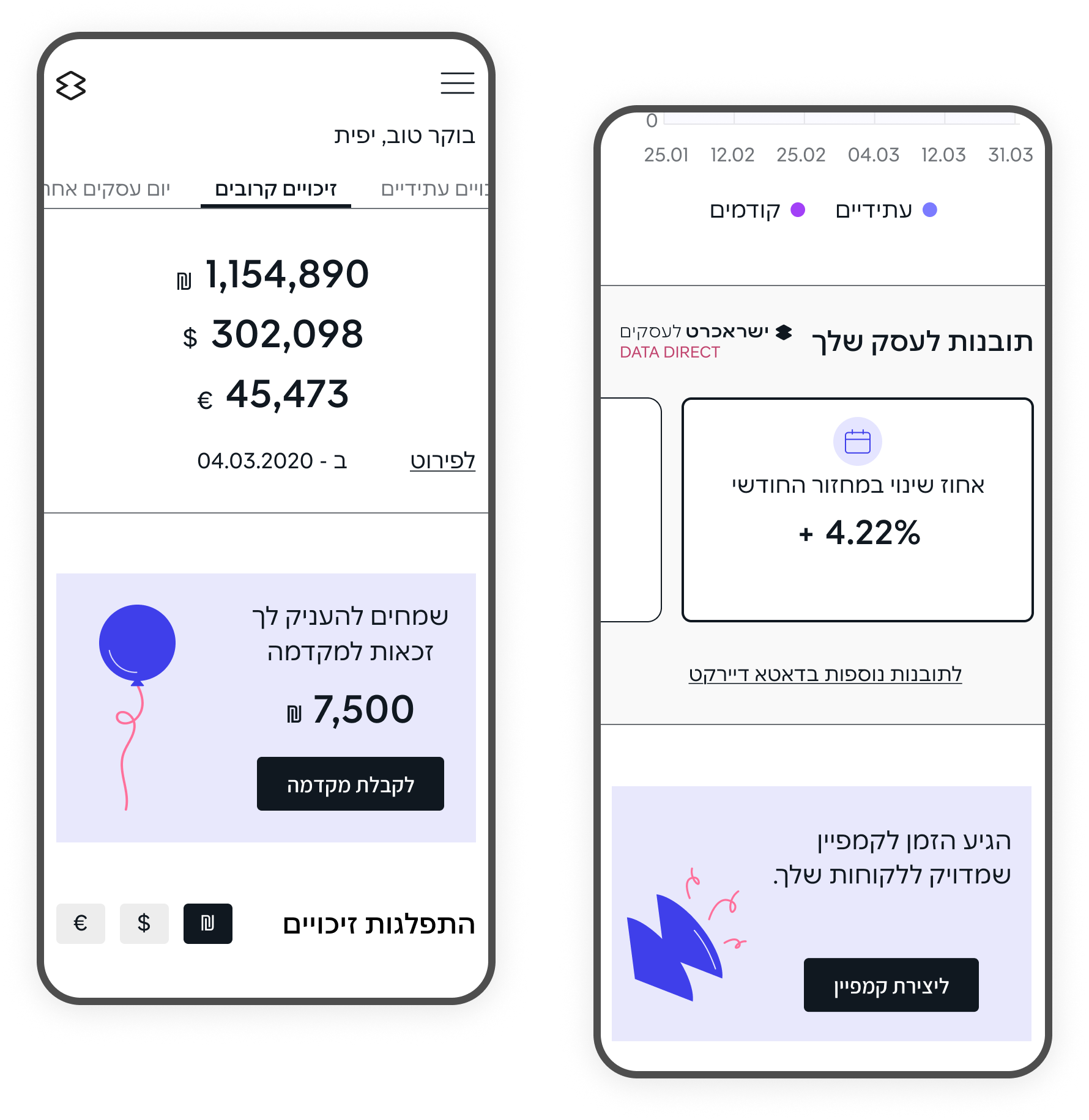
To improve data perception and analysis, the use of an interactive line chart is proposed.
This would help users navigate information more easily and support better decision making.
A horizontal layout with swipe interactions is proposed to reduce vertical scrolling and improve data perception on mobile.
Competitor research focused on mobile dashboards and data-heavy apps, exploring how they help users scan key metrics, spot changes quickly, and take safe actions on small screens. This helped identify current trends in interface development and provided valuable insights into how companies address challenges related to financial management and reporting.

The research results informed design decisions on data structure, visual clarity and mobile interaction patterns.

The credits section was treated as a primary business area. KPIs were highlighted for immediate visibility, while financial information was structured into tabs to reduce overload and improve scannability on mobile.

To improve data perception and analysis, the use of an interactive line chart is proposed. This would help users navigate information more easily and support better decision making.

A horizontal layout with swipe interactions is proposed to reduce vertical scrolling and improve data perception on mobile.
The solution focused on adapting the B2B dashboard for mobile use with mobile-specific improvements for everyday business monitoring.
The interface was refined through clearer hierarchy, emphasis on key metrics and restructuring of data-heavy sections, while preserving consistency with the desktop experience to reduce cognitive load.
The design solutions focused on improving how key business data is presented on the mobile dashboard
The goal was to align the mobile app visually with the desktop dashboard, so users feel familiar with the interface and do not need additional learning.
At the same time, elements were adapted to the mobile context to ensure more convenient and intuitive interaction with the features
The Quick View feature was redesigned to provide instant access to key KPIs and recent financial activity without opening the full dashboard. The interface focused on fast recognition of critical metrics and a simplified entry point for frequent mobile use.
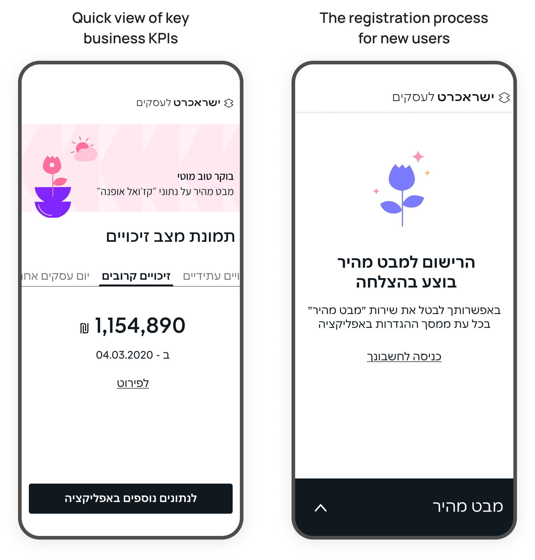
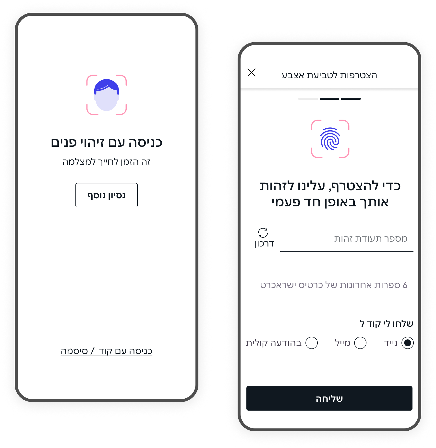
Face recognition and fingerprint authentication were added to support fast and secure login to the mobile app. These features reduce friction for frequent users while maintaining a high level of security for sensitive business data
The project focused on structuring key business data for mobile use, enabling users to quickly grasp business performance and take action on the go.
Through simplified layout, prioritized metrics, and clearer visualizations, the mobile dashboard supports fast scanning and confident decision making in short, frequent mobile sessions.