Families do not receive real-time information about whether daily care tasks for an elderly person have been completed, such as caregiver visits. This lack of timely confirmation creates uncertainty, stress and makes it difficult to ensure consistent care.
According to the Central Bureau of Statistics of Israel, the proportion of people aged 65 and older is expected to exceed 14% by 2030, with a significant increase in the 75+ group.
This trend creates a growing need for digital tools that help families coordinate daily care, track tasks and stay informed in real time.

Interviews were conducted with participants aged 47–67, including family members of elderly people, caregivers and a social services representative, to understand how daily care is coordinated in real life.

When a caregiver doesn’t arrive, the elderly person, their family and the care agency are not always informed. As a result, the elderly person may remain without proper care until the family notices the issue.

Relatives and caregivers share care responsibilities, and without a clear system, tasks are often overlooked and left without proper follow-up.
Family members are not always able to reach the elderly person by phone, which creates constant anxiety and uncertainty about their safety.

Caregivers often lack clear information about which medications an elderly person should take and how. As a result, families rely on handwritten lists, phone calls, and manual checks to track medication intake.
I reviewed existing elderly care solutions and adjacent products for task management, group communication and remote monitoring. The goal was to understand how coordination and visibility challenges are solved in other contexts and to extract patterns for the future product structure.

Analysis of selected products helped identify UX patterns that reduce risks of lost control and uncertainty in care. These insights shaped the core interaction principles and a user-centered product structure.

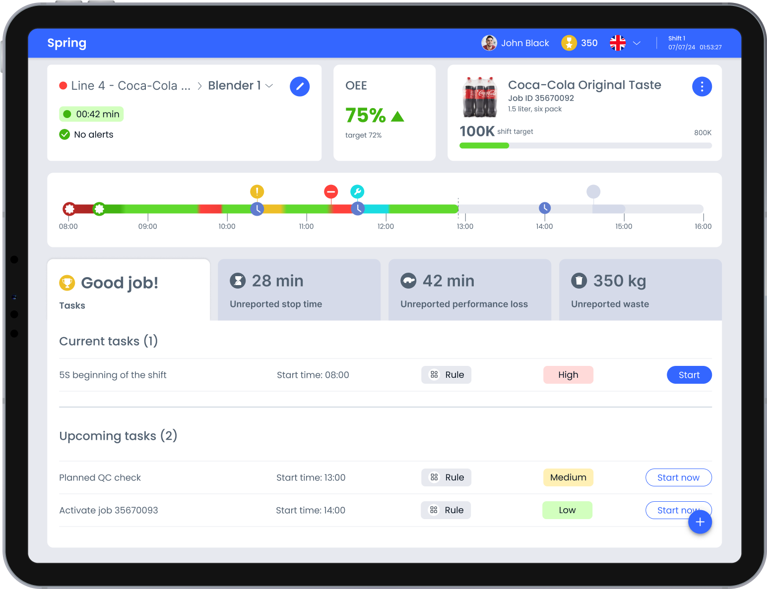
The interface relies on familiar industrial color conventions, green, red, yellow, to make line status readable at a glance.
This reduces dependence on text labels and supports fast reactions when operators monitor equipment from a distance or without full visibility of the line
Geolocation-based confirmation records caregiver arrival and departure times and notifies the administrator about completed visits.

It is necessary to create a centralized list of medications for the elderly person, with the ability to edit it, track medication stock and mark the time medications are taken.
A solution focused on making everyday care transparent and manageable for families and caregivers.
The design organizes care into shared tasks, scheduled visits and medication records, creating a common picture of the elderly person’s daily routine
This structure supports accountability between participants and provides families with a reliable way to monitor care even when they are not physically present.
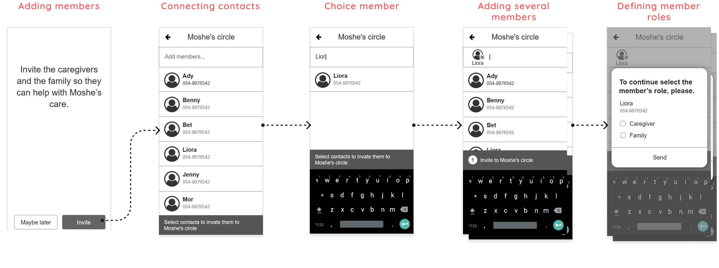
After analyzing user interviews and key UX patterns, I created the application architecture to visualize the user flow and define the necessary screens, prioritizing decisions that prevent missed care and coordination gaps.
Several alternative structure options were tested to reduce cognitive load and prevent errors in real care scenarios.
Focusing on the administrator flow allowed me to define the entry logic, permissions and journey of the care circle. Other roles reuse the same structure with limited access, keeping the interface predictable for all participants.

To translate research insights into a clear and workable user flow, I created low-fidelity wireframes and validated them through quick usability tests.
During this stage, I identified that the onboarding flow was cognitively demanding for users. Since the product becomes valuable only when several participants are involved, I split onboarding into two clear steps:
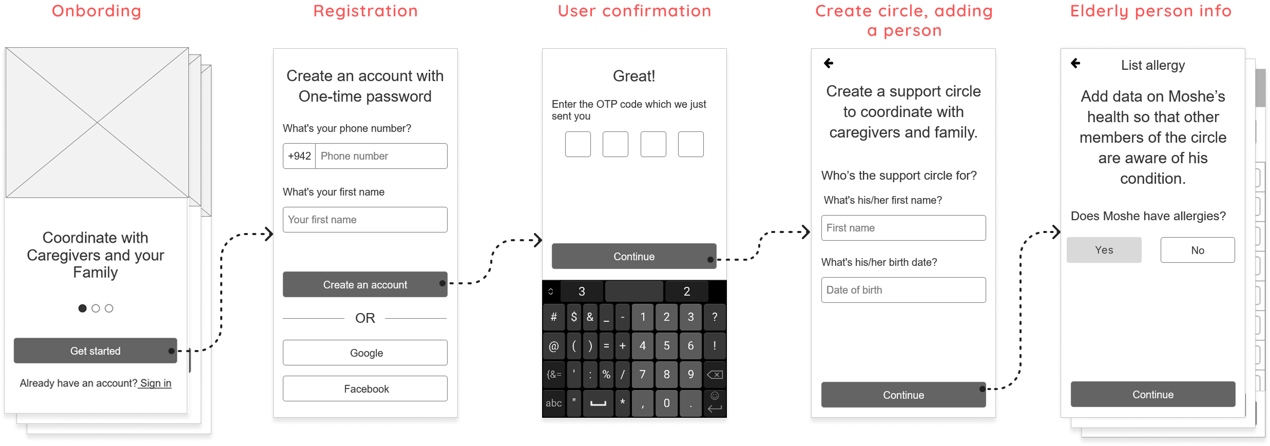
This stage translates research insights and product architecture into practical interface decisions. I designed the core screens, interaction patterns and visual hierarchy to support real shared-care workflows and minimize ambiguity between family members and caregivers.
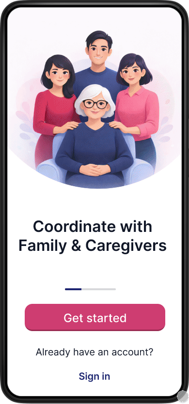
The onboarding flow guides the care coordinator through creating a care circle and adding key information about the elderly person.
This step establishes a single source of truth for care coordination before additional participants are invited.
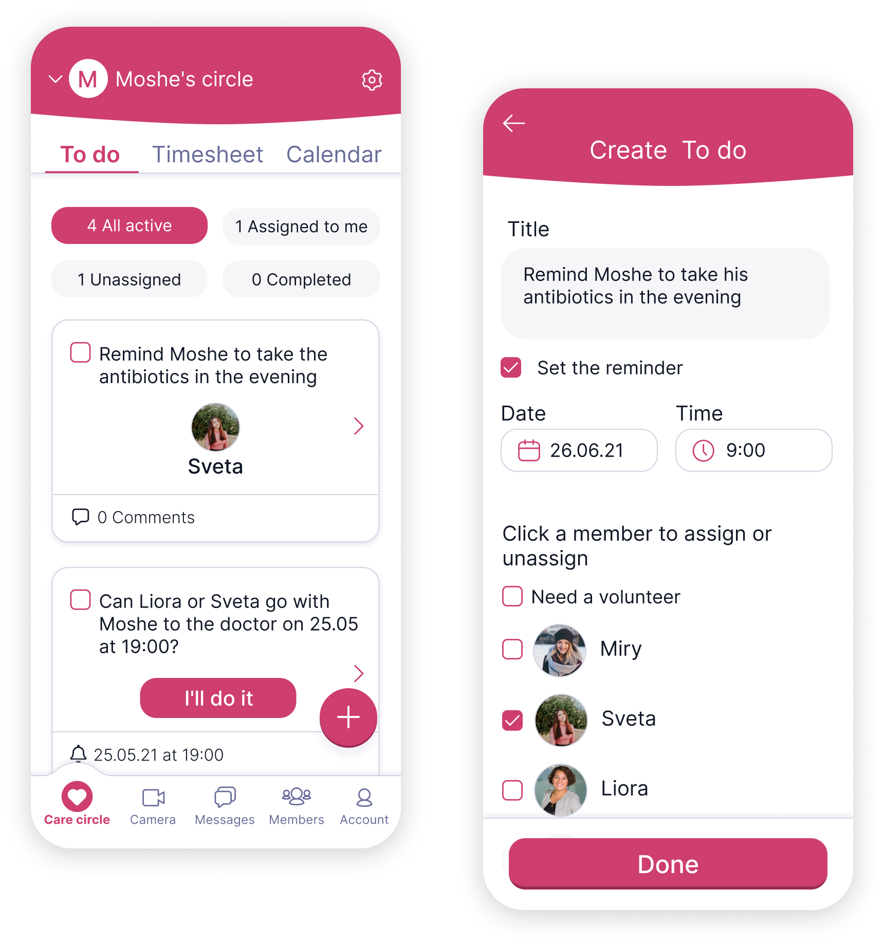
The To do flow solves the loss of control caused by shared responsibility.Clear task ownership makes it visible who is responsible, reducing family anxiety and the risk of missed care.
The medication flow translates complex instructions into a simple, scannable structure. Clear timing, dosage and status cues help users act with confidence instead of relying on memory, reducing anxiety and the risk of mistakes.

Visit statuses act as an early warning signal.
Missed visits become visible the same day, reducing risk and increasing accountability.

An interactive prototype was created to demonstrate the main user flows and validate key interaction decisions.
This allowed quick evaluation of usability and flow clarity before moving forward.
I transformed fragmented care scenarios into a structured system with clear roles, shared responsibility and traceable actions, making daily care for elderly people visible, coordinated and easier to manage.