The original dashboard had become visually and functionally outdated and did not meet modern usability standards. As a result, the interface felt overloaded and the data hierarchy remained unclear. Key financial metrics were buried among secondary information, increasing the time required to analyze data and make decisions.
The primary users of the management dashboard are company employees responsible for financial metrics and business outcomes. The dashboard is used to monitor performance and make day-to-day business decisions.
Around 90% of users use with the system on desktop in an office environment.
Product analysis was based on internal product data, support requests, and a detailed review of the existing dashboard, focusing on real usage patterns and recurring issues in daily financial decision-making workflows.

Based on product analysis, user context and pain points, the key interface issues were defined to guide the redesign process.

The registration process for new clients requires extensive data input, creating difficulties for new users.

Deeply nested navigation and unclear hierarchy.
Key sections and reports were hard to find.

The registration flow was complex and prone to input errors.
Before starting work on the dashboard, a competitor analysis was conducted. Credit companies and banks were reviewed to understand the approaches used to improve data management and operational processes.
Similar dashboard solutions from parallel industries were also reviewed.

This helped identify current trends in interface development and provided valuable insights into how companies address challenges related to financial management and reporting.

Place key KPIs at the top of the page and establish a clear data hierarchy. Visualize part of the information using charts and graphs to enable quick understanding of the business state and accelerate decision making.

Structure navigation through a logical hierarchy and grouping of sections, placing it in a side sidebar to simplify finding required actions and information.

Divide the registration process into clear, logical steps with a visible progress indicator to reduce the feeling of overload when entering large amounts of data
The solution focused on updating the UX and UI of the management dashboard to make the system more intuitive and convenient for everyday use.
The goal of the redesign was to create an effective responsive digital platform that helps users navigate large volumes of data, quickly assess business performance and make informed management decisions across different screen sizes.
The proposed solutions are aimed at optimizing key business scenarios and increasing overall productivity when working with the system.
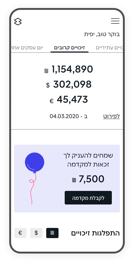
The homepage was redesigned to improve data hierarchy and make key KPIs easier to scan.
Charts and interactive elements were added to surface the most important insights first, while still allowing users to drill down into details when needed.
This reduced cognitive load and supported faster, more confident decision-making in daily workflows.


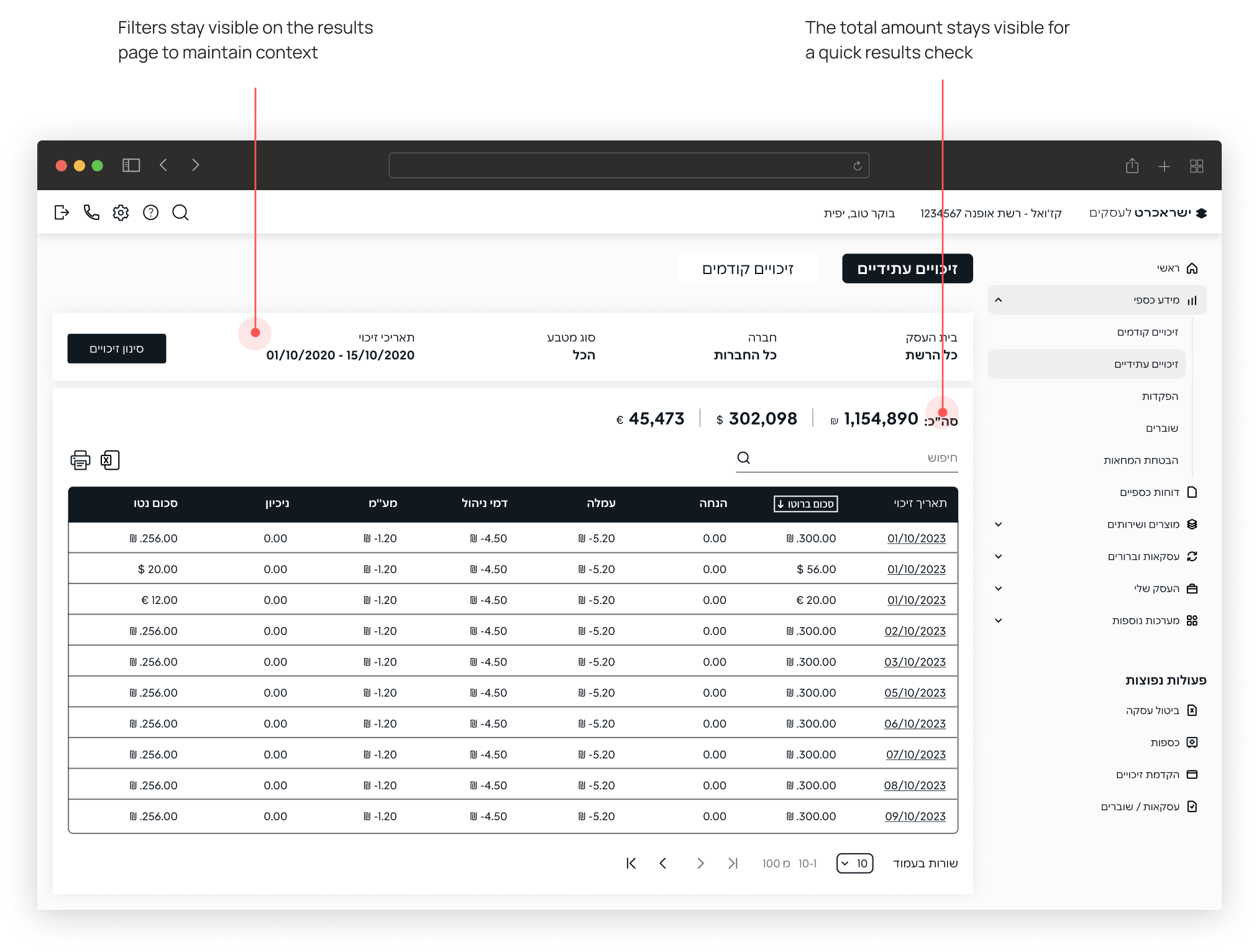
The filtering experience was redesigned by reorganizing input fields, adding subheadings, and refining microcopy.
The goal was to create a clearer and more efficient way to search and work with large datasets.

Filtering and results were split into two connected screens to keep context and reduce overload.
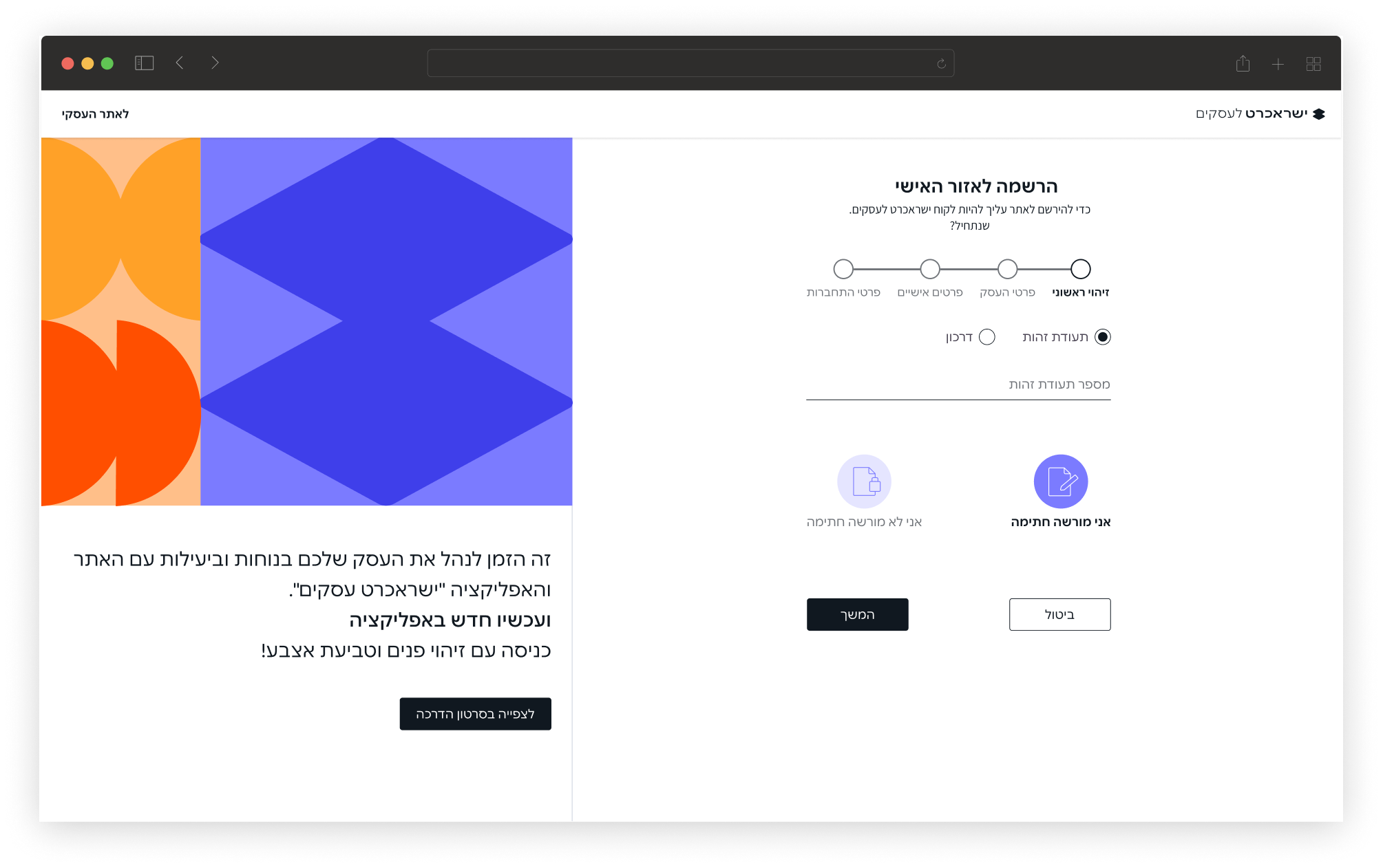
The registration flow was divided into clear, step-by-step stages, supported by a progress indicator and descriptive headings.
This makes the process more predictable and helps reduce errors during completion.
The redesign reduced cognitive load in a data-heavy B2B dashboard by improving structure, hierarchy, and consistency. Key workflows were simplified and standardized, helping users find information faster and complete tasks with fewer errors.