The lack of timely structured information about downtime slows decision making, increases losses, raises production costs.
Production line technicians and operators responsible for monitoring equipment status and responding to emerging issues.
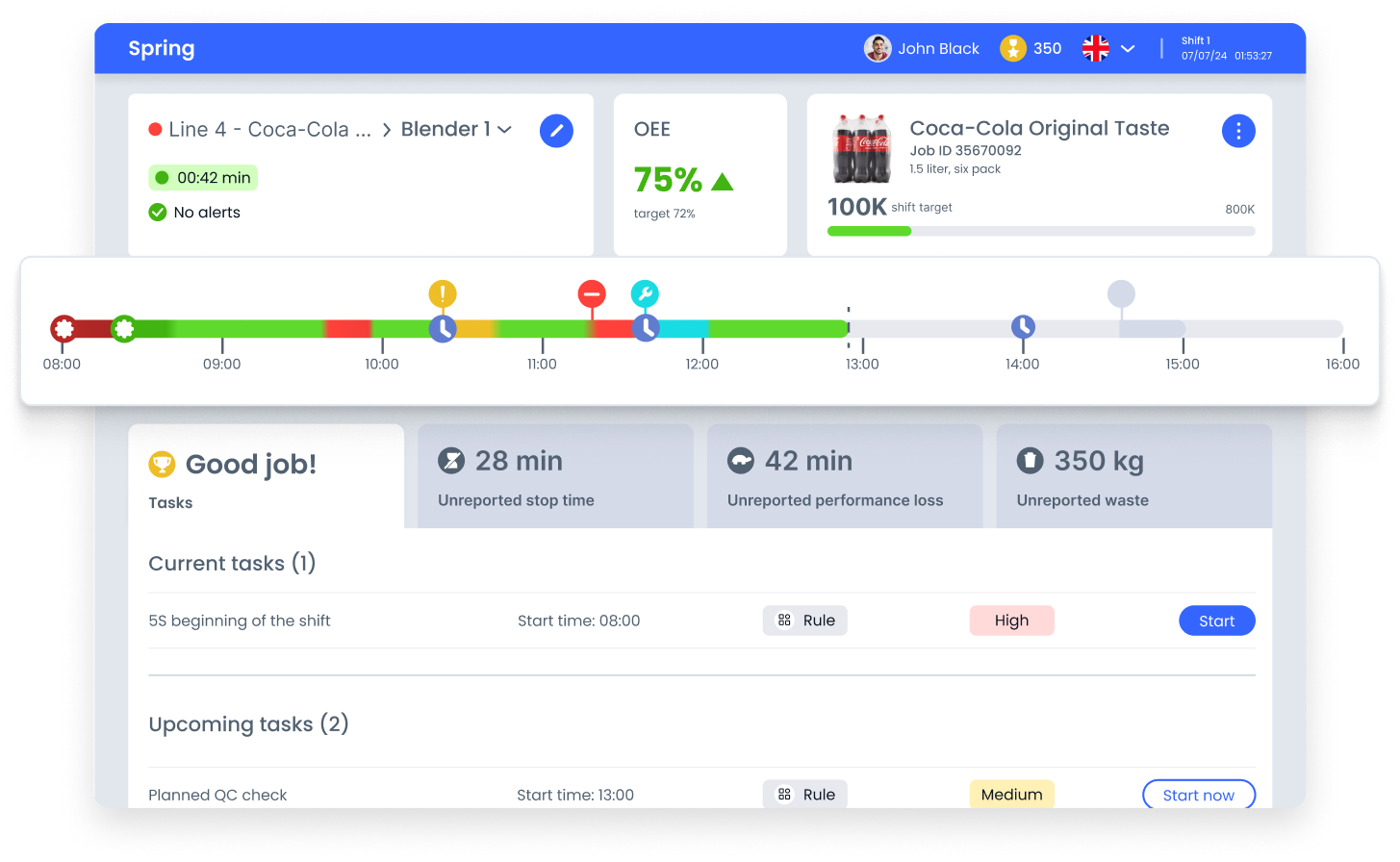
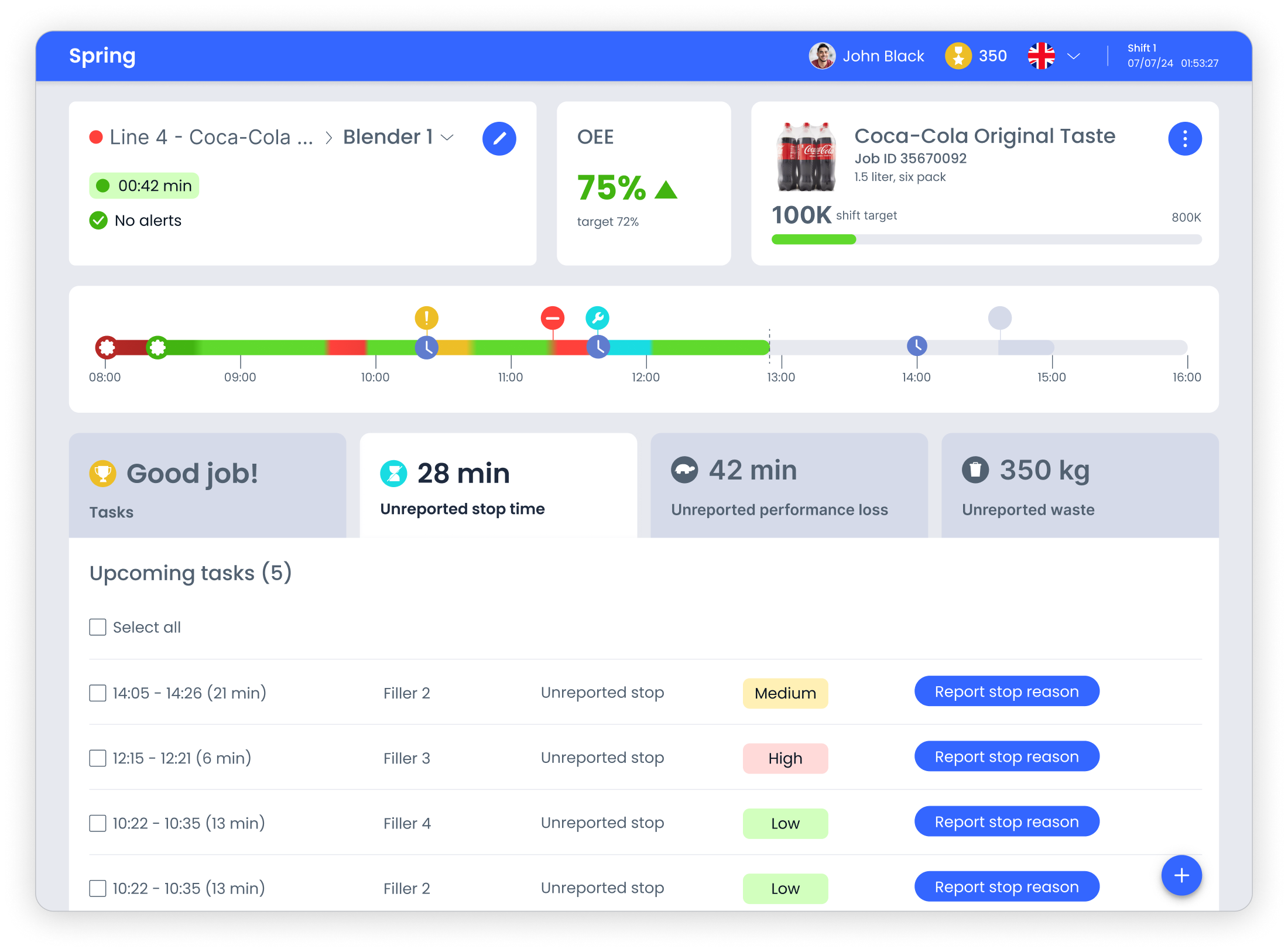
The solution focused on a tablet UI built around clear information hierarchy and operational status visibility.
The interface combined timeline visualization, status indicators and task management to help technicians quickly assess line conditions and take immediate action.
The interface helps operators quickly grasp the current production line status and understand the causes of downtime. A clear visual structure and minimalist approach reduce cognitive load and keep focus on key operational indicators.
These design decisions reduce the time needed to assess the situation and support confident, immediate action.
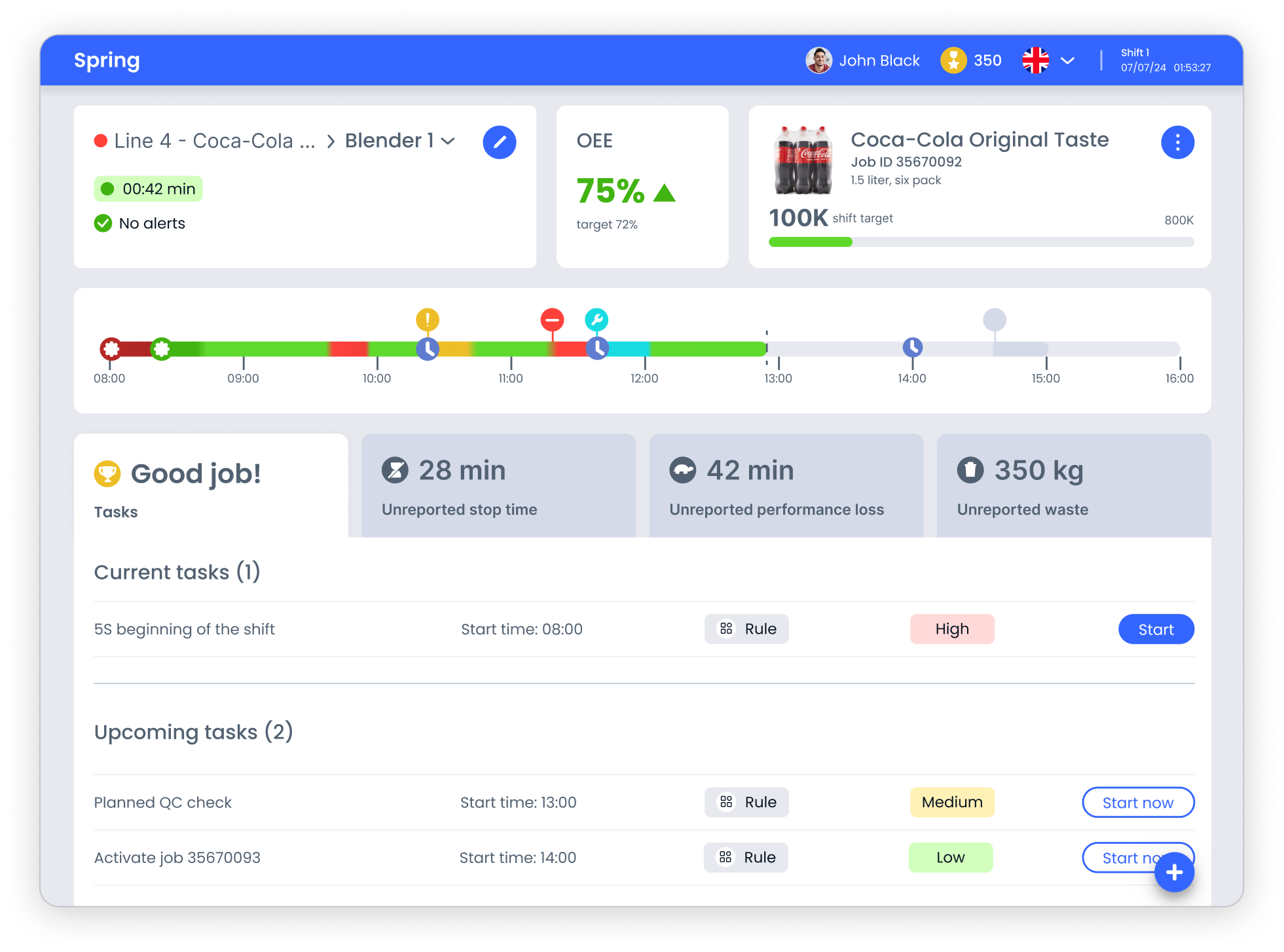
The interface is built around the principle of instant readability: the operator should see the problem before starting to analyze details. The visual structure helps quickly orient in the line status, highlight priority events and move to actions without extra steps

The interface relies on familiar industrial color conventions, green, red, yellow, to make line status readable at a glance.
This reduces dependence on text labels and supports fast reactions when operators monitor equipment from a distance or without full visibility of the line

Task cards, OEE metrics and status blocks are arranged through a clear hierarchy that directs attention to the most critical signals first.
This structure lowers cognitive load and decreases the risk of overlooking urgent events during busy shifts

The timeline brings events onto a single scale, showing sequence and duration in context.
Status markers and gradients help operators understand how incidents evolve over the shift and decide where intervention is needed
The interface groups controls by real usage context, monitoring, tasks and reporting, to minimize search effort and make daily actions predictable.
Visual hierarchy prioritizes critical signals over secondary data, using scale, contrast and layout rhythm to guide attention naturally across the screen. This supports confident decisions during brief interactions between physical tasks.
The modular layout maintains consistency across scenarios and allows the system to evolve without increasing cognitive load.
In this project I transformed complex operational data into a structured, readable interface. I introduced clear visual hierarchy, consistent status language and tablet-friendly composition, which made key signals easier to recognize and actions more predictable.
The result is an interface that supports fast orientation, confident prioritization and comfortable daily work on the production floor.