Seder · Startup

EdTech learning platform

  • ROLEUX/UI Designer
  • CATEGORYB2B2C
  • PRODUCTStudent learning experience
  • TYPEUX/UI redesign · Web
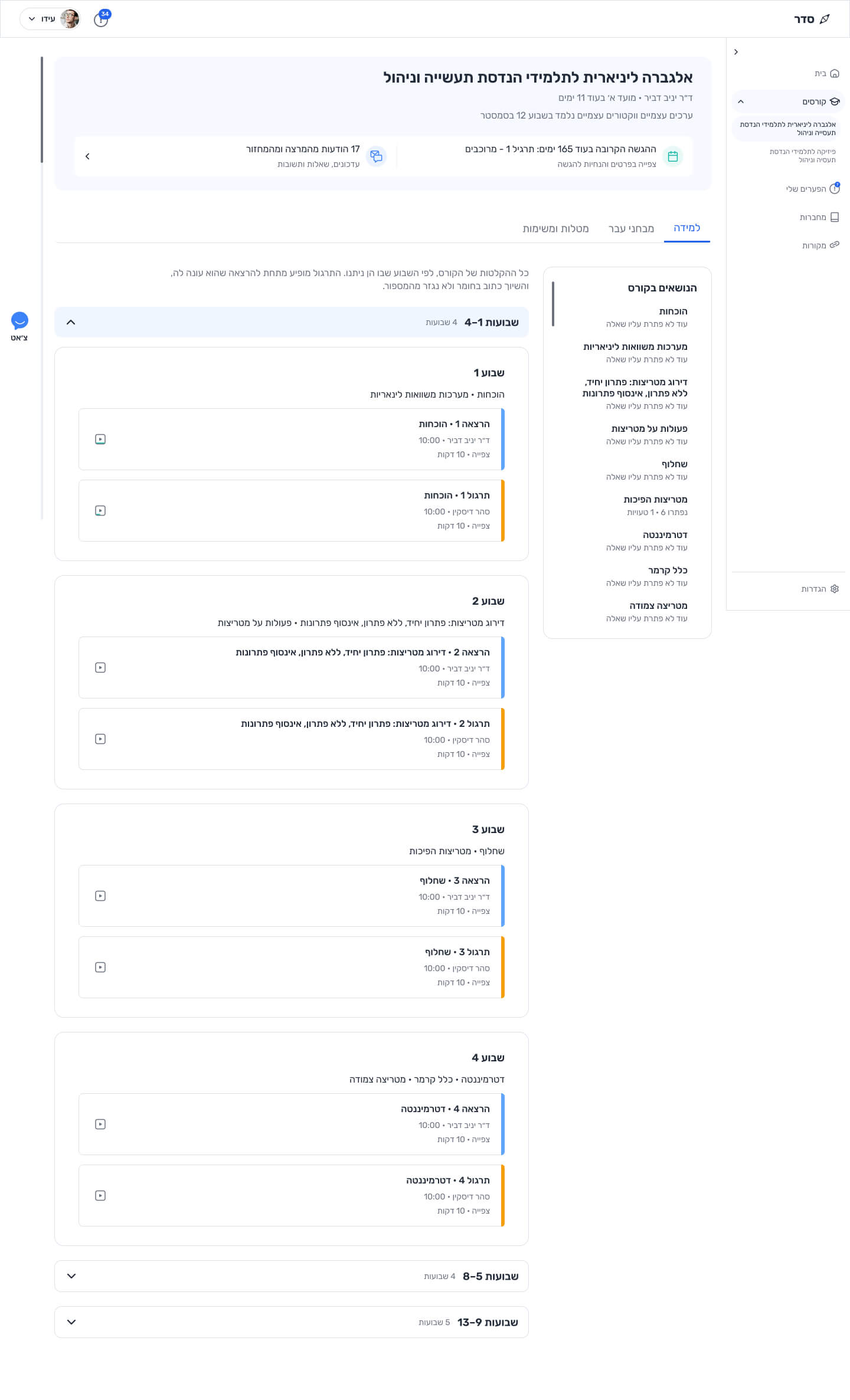
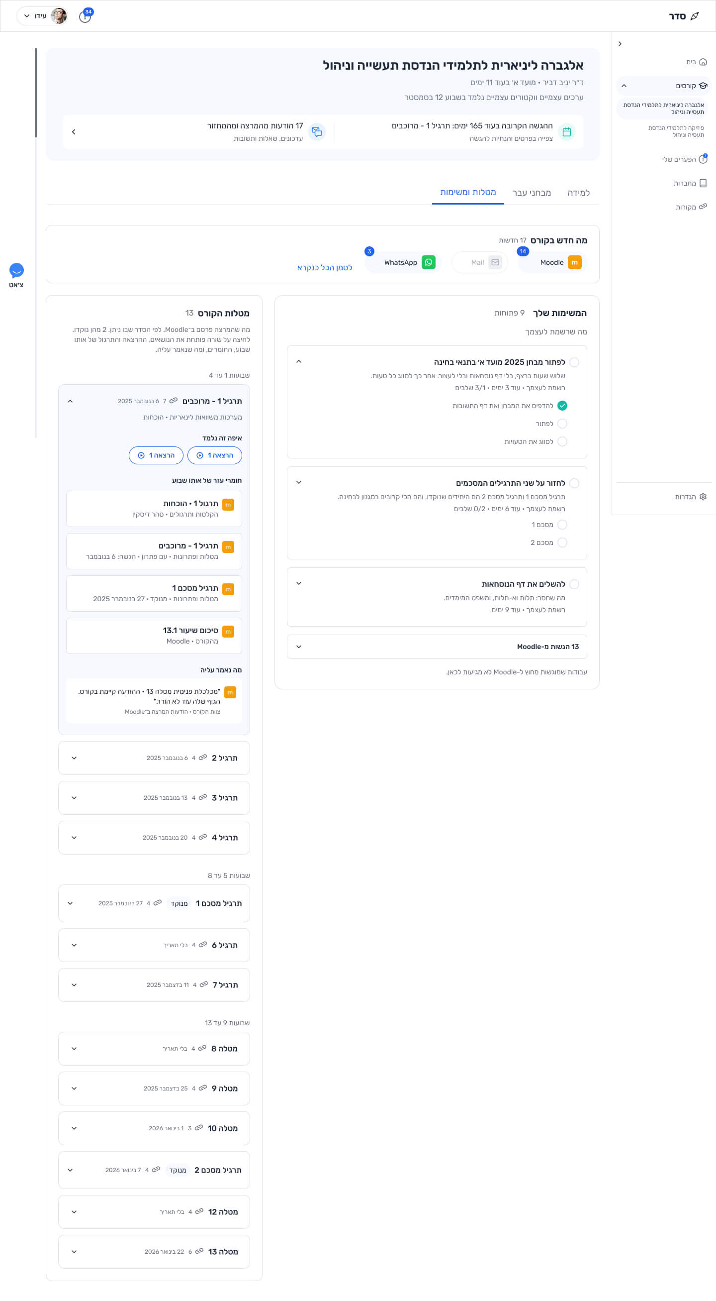
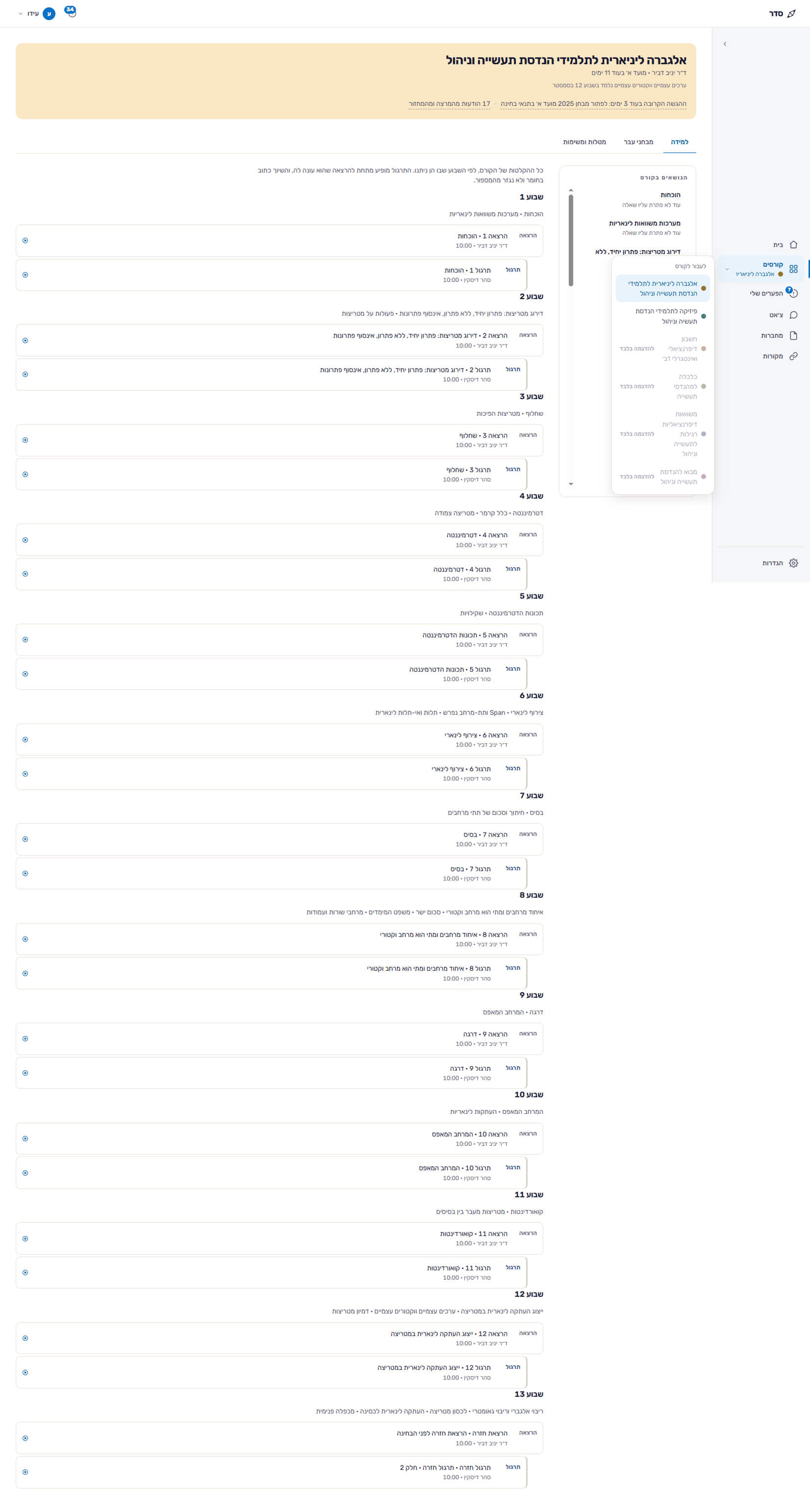
Redesigned Seder course overview in Hebrew: course header, Learning tab with expandable week groups, lecture and practice sessions with blue and orange cues, and the course topics index
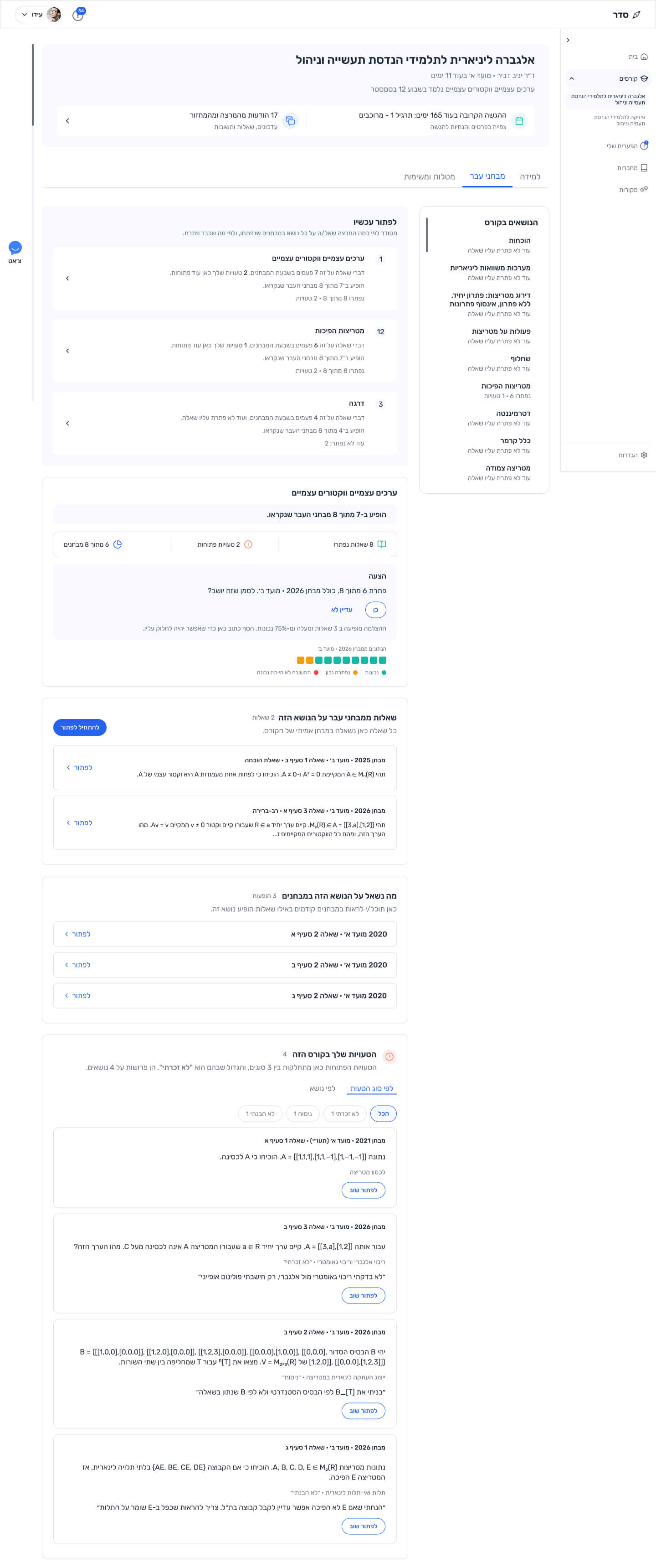
Redesigned Past Exams view: topics to solve now and a topic card with solved questions, open mistakes and exam history

Seder in numbers
Fusion × Base4U
Startup Competition

  • 700+Startup applications
  • 15Finalists

Overview

Seder is an EdTech platform that brings course materials, practice and learning-gap insights into one environment. Its broader B2B2C model connects students and educational institutions.

I joined the Seder team as they prepared a working product feature for the next stage of the Fusion × Base4U startup competition.

Timeline

Platform

Web

My role

  • UX Review
  • Prioritization
  • UX/UI Design

Collaborated with

Seder co-founders

Design goals

After showing the early prototype to students, the team identified three recurring concerns: too much information at once, uncertainty about the next step, and an intimidating volume of red error messages.

  • Clear learning direction

    Help students find course materials, identify knowledge gaps, and understand what to focus on next.

  • Purposeful learning modes

    Make lectures and practice sessions easier to distinguish while keeping the experience consistent.

  • Actionable feedback

    Replace overwhelming error messages with clear guidance and opportunities to improve.

Impact

Business

Earlier support, stronger retention

Help universities spot early signs of disengagement and support students before they fall behind.

  • Early risk signals
  • Timely student support
  • Retention as a goal

User

Know what to do next

Help students see their progress, understand learning gaps, and focus on the next step before exams.

  • Clear progress
  • Visible learning gaps
  • Focused next steps

Constraints & design decisions

  • Three days in an unfamiliar domain

    Constraint: Understand a new EdTech product, identify UX issues, and deliver a redesign within three working days.

    My response: Reviewed product materials and existing screens, identified priorities, and focused on key student course screens.

  • Complex course navigation

    Constraint: Dense learning content and overlapping navigation made it difficult to follow the course structure.

    My response: Organized content into weekly groups and clarified navigation between lectures and practice sessions.

  • Discouraging error feedback

    Constraint: Prominent red error messages risked making mistakes feel like failure.

    My response: Grouped mistakes and replaced warning-heavy feedback with clearer next steps for improvement.

The Process

Understand EdTech

Studied university learning workflows, student needs, and Seder's product vision.
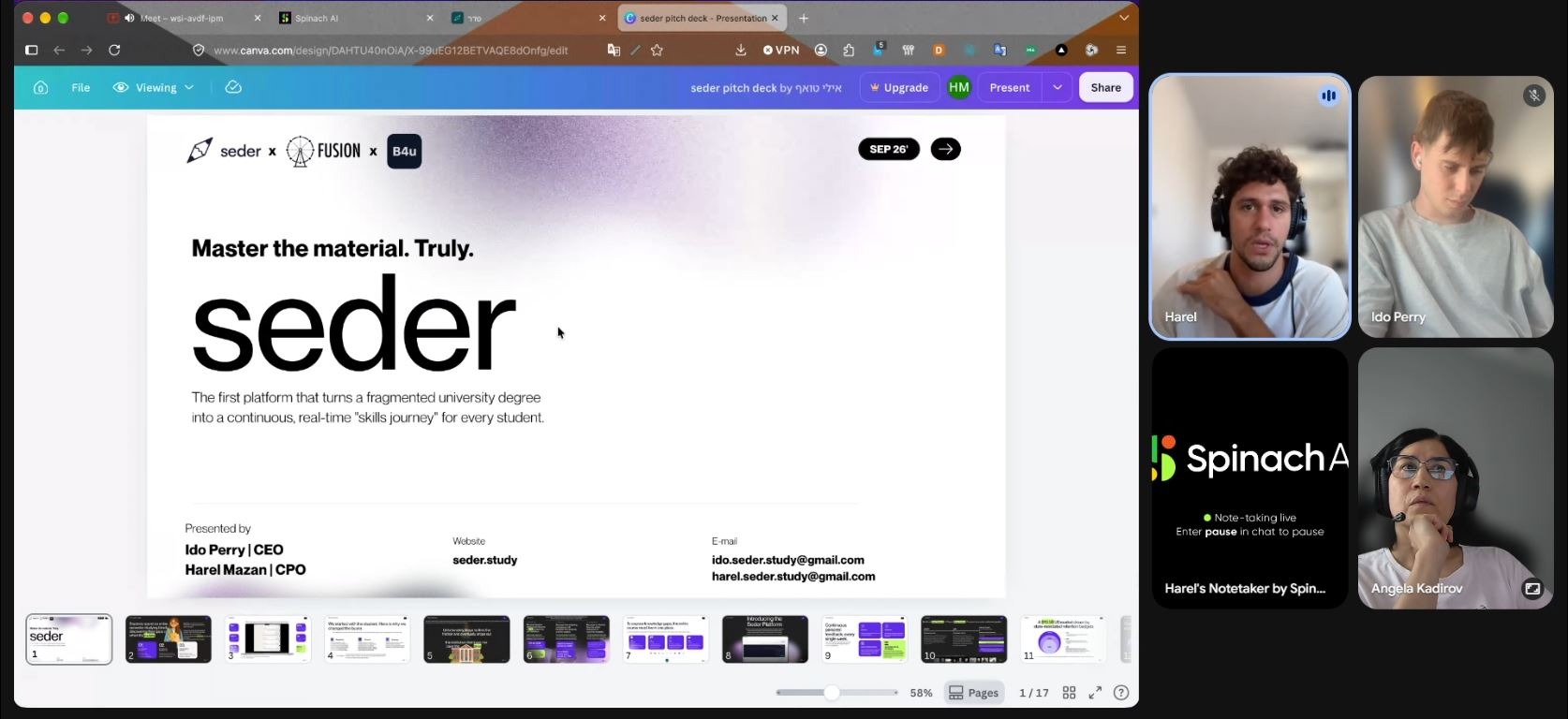
Google Meet session: the Seder pitch deck on screen, with Harel Mazan, Ido Perry and Angela Kadirov on the call
Product introduction with the Seder founding team

Audit Seder's UX

Reviewed the early screens and student feedback shared by the team to identify usability issues.

Key UX findings

  • Information overload
  • Unclear course navigation
  • Discouraging error feedback

Compare learning platforms

Explored course structure, navigation, and next-⁠step guidance across educational products.

Platforms reviewed

  • Canvas
  • Moodle
  • Coursera
  • StudyFetch
  • LinkedIn Learning
  • Khan Academy
  • Open edX

Key patterns explored

  • Collapsible course structure
  • Progressive disclosure
  • Clear next-step guidance

Prioritize and redesign

Redesigned weekly course navigation, lecture and practice contexts, and error feedback in Figma.

 AI-⁠assisted workflow

UX analysis & prompts
  • ChatGPT
  • Claude
  • Perplexity
  • NotebookLM
Design execution
  • Figma AI Agent

Target audience

Seder serves university students and educational institutions. This redesign focused on the student learning experience.

A lecturer pointing at a chart on the screen in front of university students working on laptops

Key pain points

Students

  • Fragmented course materials
  • Knowledge gaps discovered too late
  • Unclear next steps

University support teams

  • Limited early engagement signals
  • Late identification of disengagement
  • Fragmented manual follow-up

Before & After

Course page before: one continuous list of lectures and practical sessions for all semester weeks
Course page after: weeks 1 to 4 as an expandable group, lectures marked blue and practical sessions orange, later weeks collapsed, course topics beside them
Expandable group header: weeks 1 to 4

Weekly grouping

A lecture card with a blue edge and a practice card with an orange edge

Clear lecture and practice cues

Expandable group header: weeks 1 to 4

Weekly grouping

A lecture card with a blue edge and a practice card with an orange edge

Clear lecture and practice cues

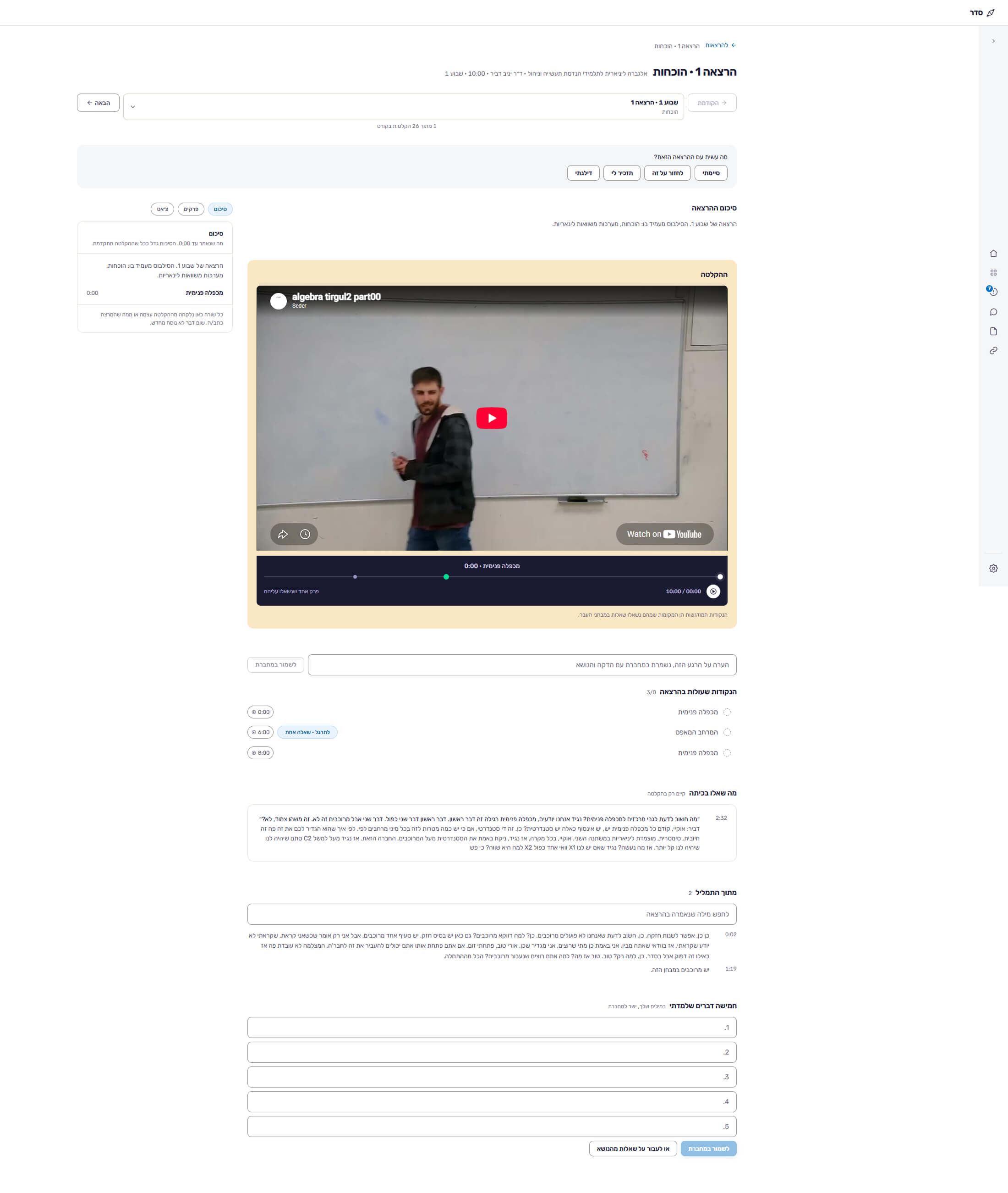
Lecture page before: session selector, status buttons, lecture summary and the recording
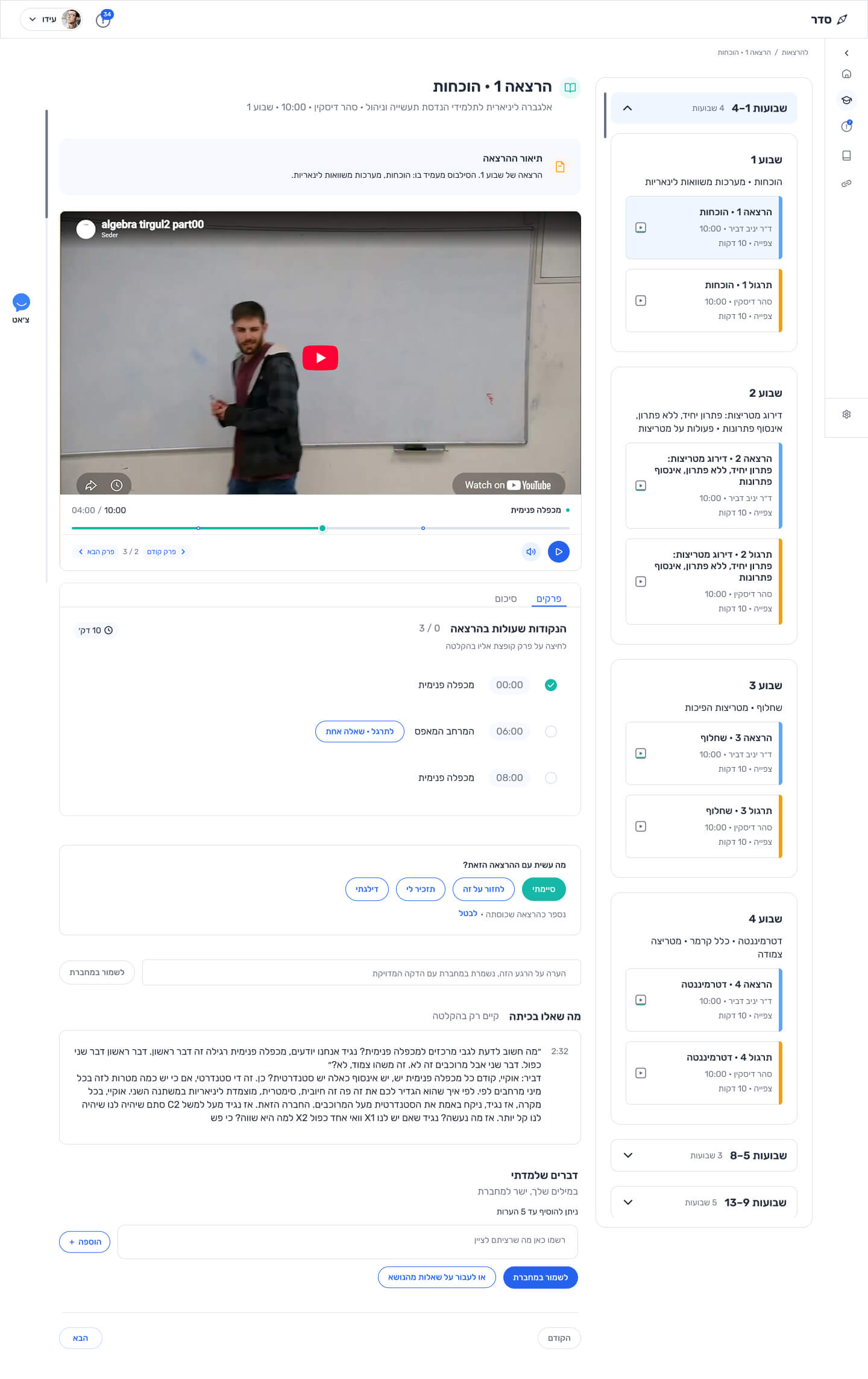
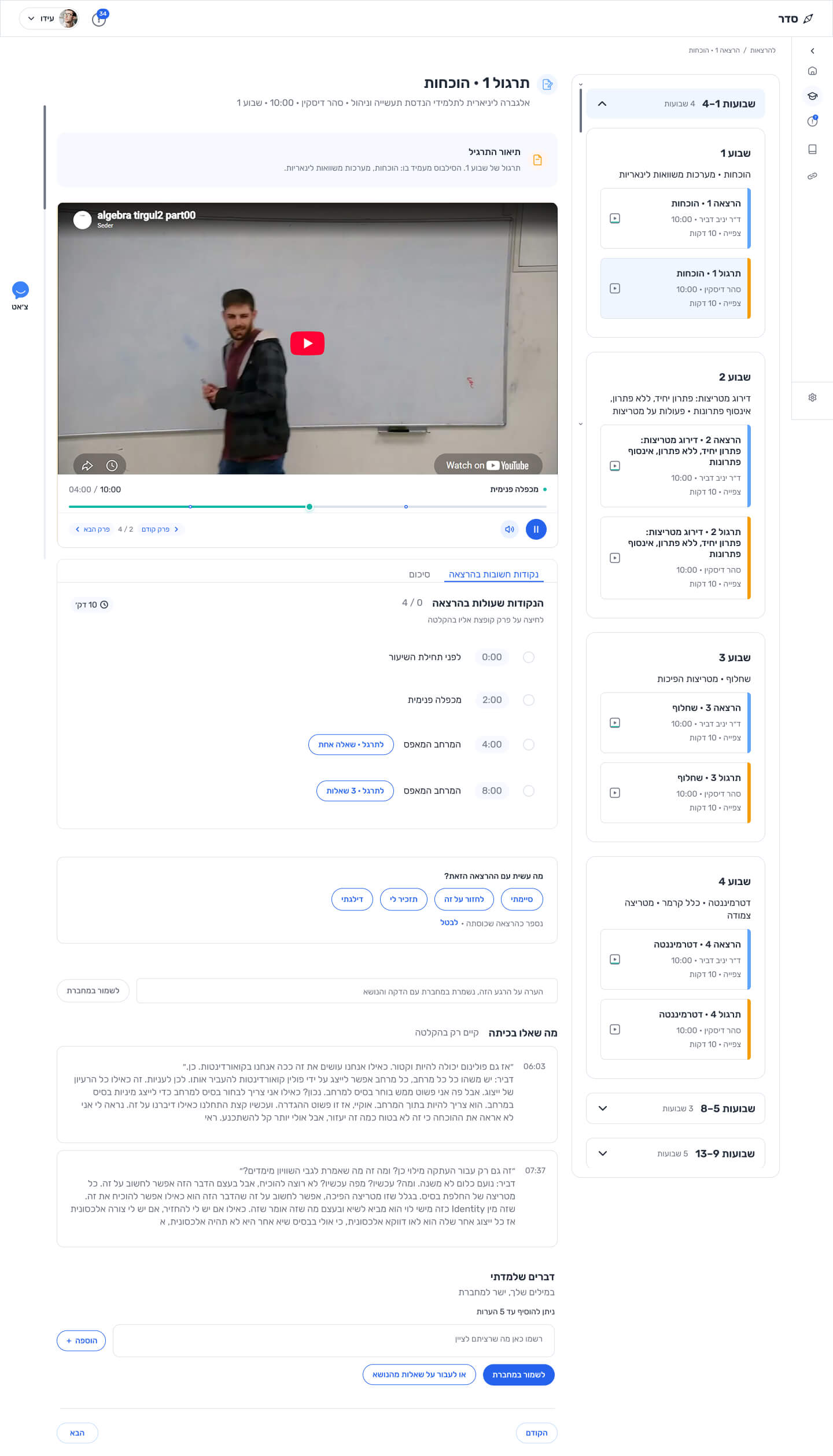
Lecture page after: session type in the title, lecture description, the recording with chapters, and the weekly course navigation beside it
Lecture title with the lecture icon and the course, lecturer and week

Clearer session context

Weekly course navigation with the current lecture highlighted

Course navigation

Lecture title with the lecture icon and the course, lecturer and week

Clearer session context

Weekly course navigation with the current lecture highlighted

Course navigation

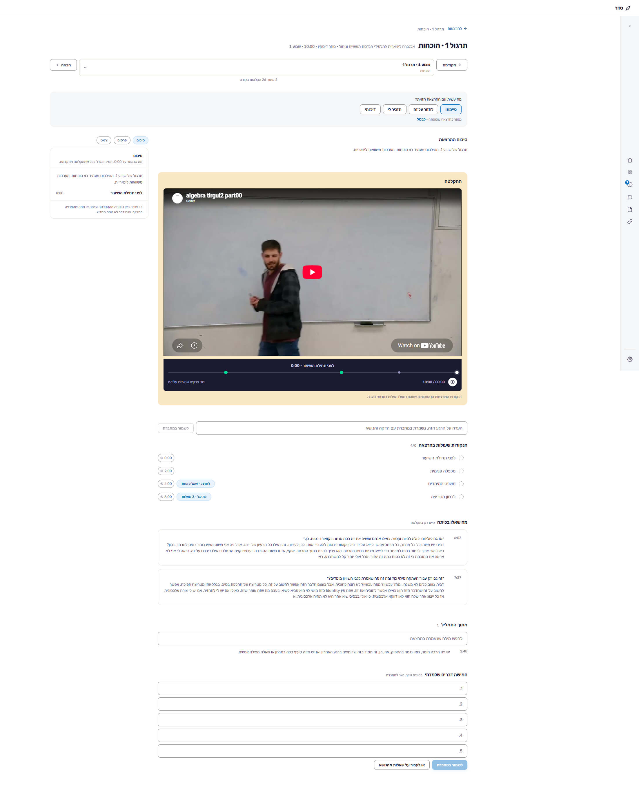
Practice session

  • Practice page before: the same layout as the lecture page
    Before
  • Practice page after: practice title and description, the recording, and the current practical session highlighted in orange in the weekly navigation
    After
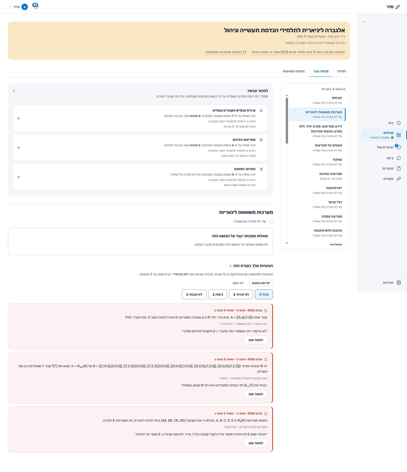
Past Exams before: the mistakes section as large red error cards
Past Exams after: the mistakes section with filters by error type and topic, and neutral mistake cards with a solve again button
Mistakes section header with filters by error type and by topic

Grouped mistakes

Mistake card with a solve again button

Retry actions

Mistakes section header with filters by error type and by topic

Grouped mistakes

Mistake card with a solve again button

Retry actions

Assignments & tasks

  • Before: assignments and tasks page
    Before
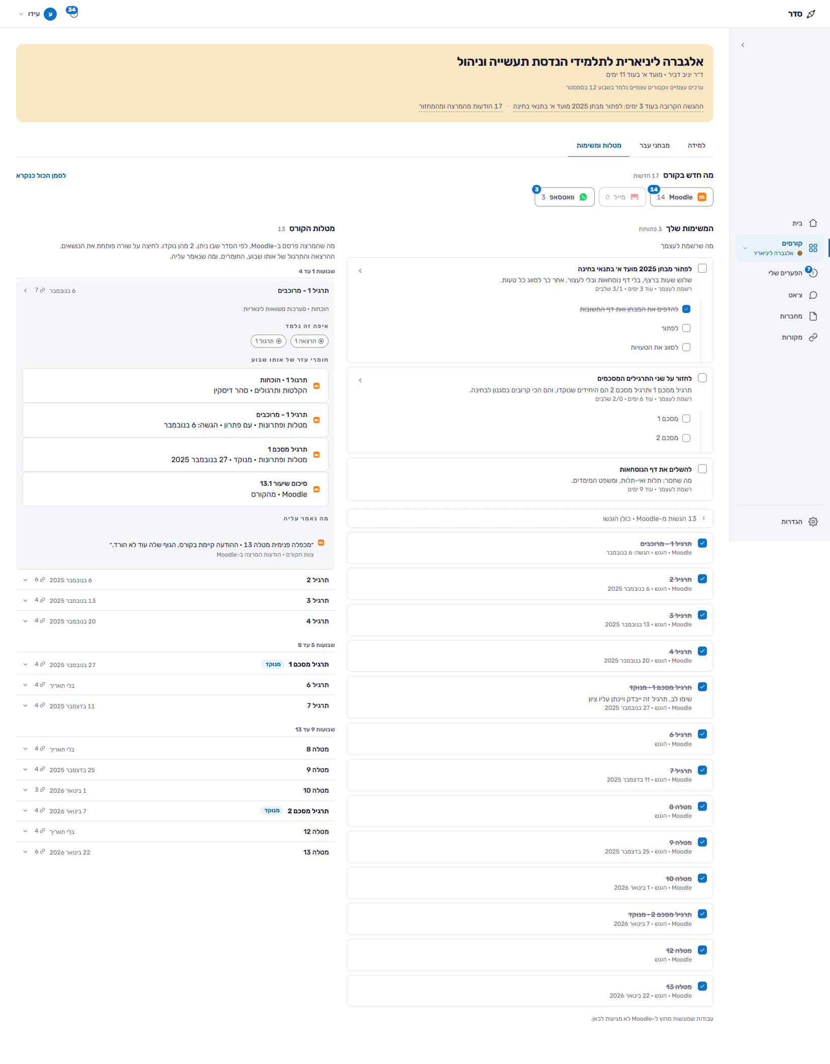
  • After: assignments and tasks page in the same visual language as the course pages
    After